Guide
Portrait 1 or Portrait 2? Queen Victoria on the 20 Cents
Queen Victoria, two portraits · written Nov. 11th 2011
The two Portraits of the Newfoundland 20 Cent coinage, are very different in appearance and are usually quite easy to distinguish from each other. However, as the coins wear, it becomes increasingly more difficult to tell the differences between these two Portraits! In spite of this problem, there are still some features which remain and these can be used to make a positive identification.
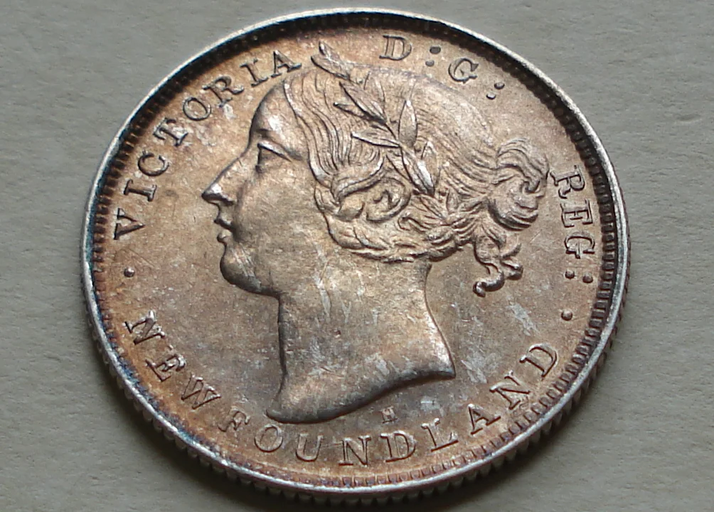
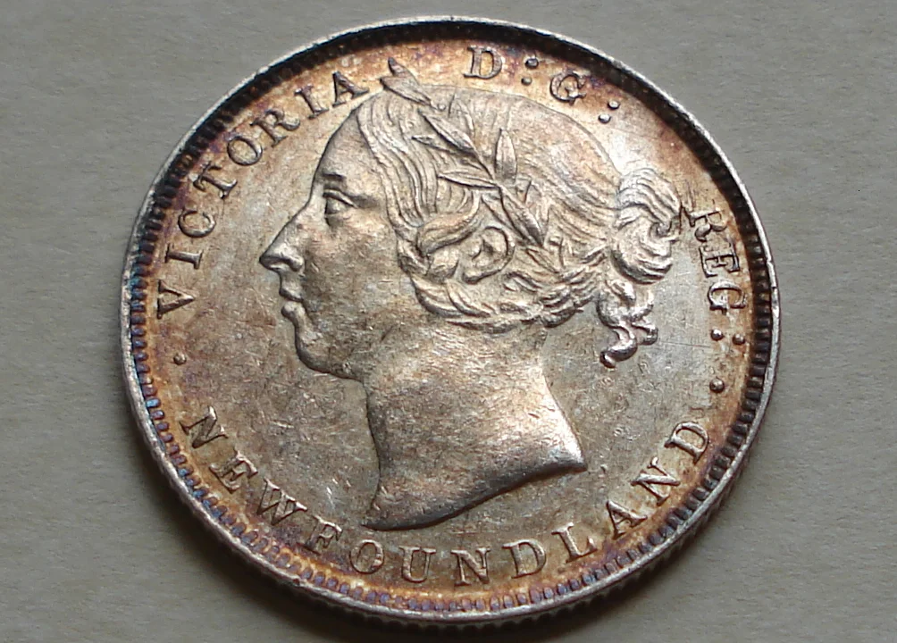
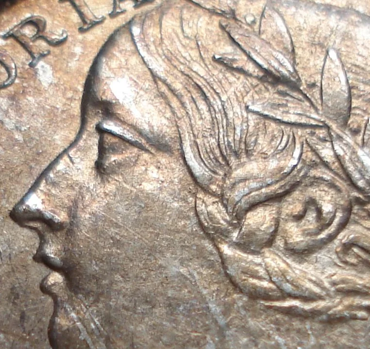
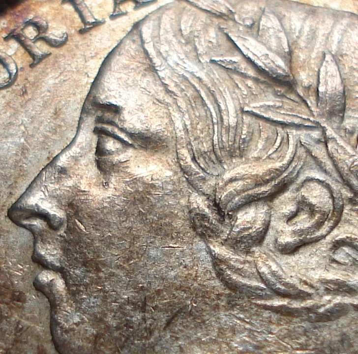
The most obvious difference between the Young and Old portraits, is the overall structure of the face. With the Portrait 1 effigy, the forehead and chin are well rounded and protrude slightly forward on the face making them very dominant features. Whereas, the Portrait 2 image is strikingly different with its facial structure! In this instance, the forehead slopes gently away to the back of the face and the chin appears to be recessed in a gentle angle, down and away from the Queen's mouth. One of the results of this variance, is that the space between Victoria's forehead and the Letter A is slightly greater with the Older Portrait.
Another difference can be found around the mouth. With the Portrait 1 image, the lips are spaced farther apart and the upper lip protrudes slightly ahead of the lower one. It would almost appear as if Queen Victoria was speaking, while in contrast, the Portrait 2 version has her lips closer together and lined evenly with each other.
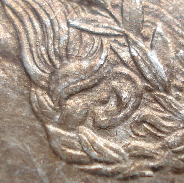
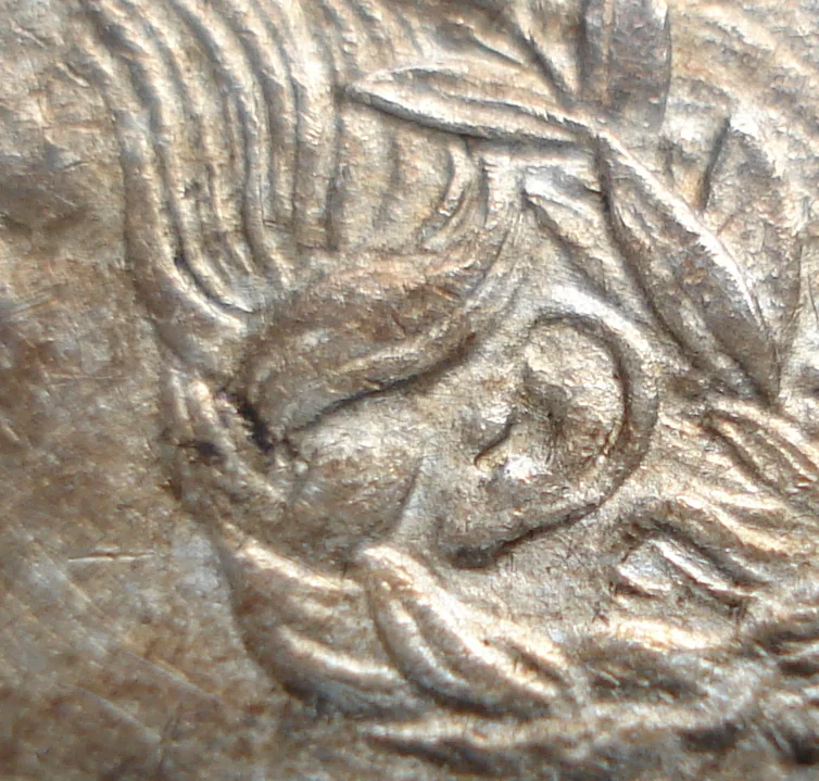
Also, if the coins are not too badly worn, both the eye and ear can be used to make a positive identification of these Portraits. The eye for the Younger version of Victoria appears to be slightly larger and the eyelids are longer and more pronouced than that of the Older effigy. With the Younger version, it seems to be somewhat lifeless in appearance, very much like that of a marble statue. In contrast, the Portrait 2 effigy illustrates a smaller and more natural looking eye, with softer and more subtle appearing eyelids.
In addition to the eye, the ear can also be used to accurately recognize the correct Portrait. In this instance, the Older image of the Queen has a very well defined earlobe, whereas, with the Younger version, it lacks any significant definition!
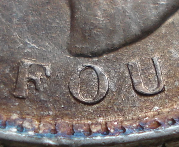
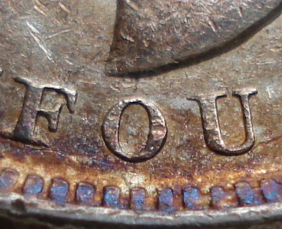
Perhaps the best way to identify these two Portraits , is to observe the spacing between the base of Victoria's bust and the letter O in the word NEWFOUNDLAND. With the Portrait 1 coins, the front point of the bust is very near to this letter, whereas, the Portrait 2 is separated from the O by a noticeably wider gap.
Side by side